
Starting off
I joined this project 1 month after its development began. It was a segment of a comprehensive design overhaul aimed at enhancing the user experience of:
- BMO stakeholders that engage with a homeowner's mortgage application during the entire mortgage life-cycle which includes receiving, processing, and finalizing the application.
- BMO customers during the process of applying for a mortgage to purchase a home.
Approach
So, Greg, the designer started the project, passed the baton to myself to Lead UX for condition management. My main goal was just to get a feel for where things were at and figure out the issues. Our team included a Product Owner, a Business Analyst, a Scrum Master, a Copywriter, a UX Researcher, QA and folks from Tech. We were all working remotely and kept in touch through Teams, agile meetings, and Figma for about eight months. During that time, I quickly spotted what our customers and the business really needed to create the right features.
Methology
The work completed was broken into four main steps: Discover, Define, Create and Deliver.
Discover
Since Greg had already made some headway on the project using semi-lean UX approach, I wanted to get up to speed by checking out what he'd done so far. I also had a chat with key folks, like the Product Owner, to really grasp the challenges we were facing. Plus, I teamed up with the User Researcher to explore user struggles, and what they're hoping for.
Tap / Click to see a ALL images larger

Define
As I dug in deeper, I found out just how complicated the mortgage process really is, along with some tricky issues that needed fixing:
There were two main systems running, each with its own team, but they just couldn't seem to get on the same page.
Users faced some frustrating usability issues. Sometimes the systems would freeze up due to UI errors, and other times, users got no feedback at all.
The process of completing the terms and conditions (TACs) was slow because of additional usability issues.
Customers often thought they had uploaded all their documents, which caused delays in getting their applications processed.
Finalizing a mortgage application usually took about 45 minutes.
And getting approvals? That often took more than 24 hours.
Overall, it could take customers up to 3 days or even longer to wrap up their applications.


Create
First, we understood that main systems were there to stay, so we planned to plug each system into the refreshed experience to make everything look and function seamlessly.
To make things easier for everyone, usability errors were eliminated by creating a new system by breaking the system into clear parts and creating a TAC system:
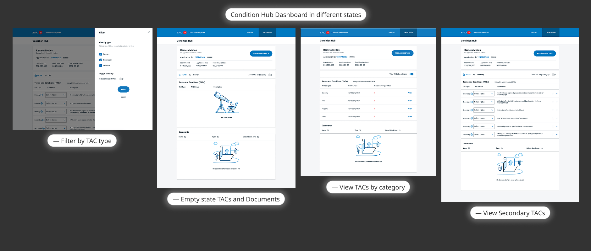
FOUR DASHBOARD PARTS
- Client's application status and application information.
- A filtering by type — So that everyone could focus on or find the items they are looking for.
- Terms And Conditions — The requirements that need to be met for the application.
- Documents — Uploaded paperwork to support the mortgage application.
TACs SYSTEM
- TAC types: Everyone would identify ownership and importance the TAC should be completed in.
- Primary — Most important to satisfied.
- Secondary — Can be dealt with a bit later.
- Solicitor — Used by the lawyer of the application.
- TAC status: So the reviewer would be notified of the new status, once document.
- SR — Satisfied or Security received.
- VR — Verbally received.
- ID — Income discretion.
- SD — Security discretion
- IT — In transit.
- N/A — Not applicable
- TAC description: Everyone could easily learn what each TAC was for.
By clearly showing how simple it is to update each TAC, we're helping users breeze through the application process. Plus, users can easily add more TACs whenever they need!
So, once everyone wraps up the initial stage of the mortgage process, they move on to the condition management phase, which starts off with the system recommending TACs based on the personal info provided. All users have to do is check the ones that fit.
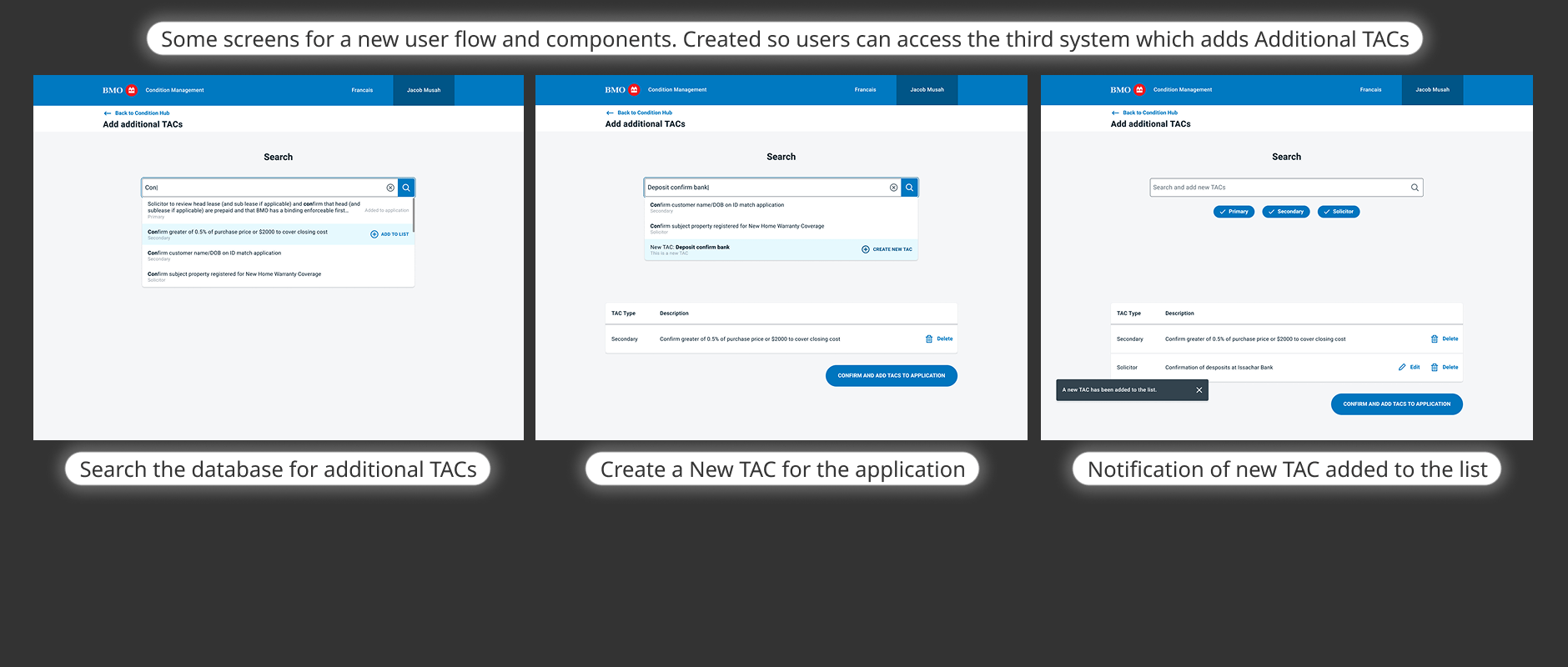
Later in the project, I learned about a third system that had some extra mortgage options(Application characteristics) that could be added to an application when necessary.

No items found.
Deliver
As I built and added features, we also pulled in components from the design system to create a smooth experience. Some new components were put together to ensure everything was ready for launch. Along the way I teamed up with other designers for feedback, collaborated with the copywriter to polish the text, and chatted with the tech team to understand any limitations. I quickly put together a prototype so UX research could test it out and gather more user feedback right before we went live.
The product owner teamed up with the business analyst to get everything launched. By this point, the 8-month deadline had come around, so it was time for me to move on from the project.
25

Minutes to complete purchasing
16

Minutes to application approval
1

Day to complete application