
Return to work
 CASE STUDY / 04
Customer Dashboard Onboarding
Changing the way new and existing customers accessed their most important insurance information. Sonnet's original dashboard, launched in 2016, grouped policy rows separately from a detached Quick and Easy block — leaving customers without a clear, policy-contextual path to documents, payments, and self-service actions. As lead on UX, interaction, and visual design oversight, I redesigned the dashboard to contextualize actions within each policy, clarify self-service destinations, and introduce a coherent responsive presentation across desktop and mobile.
 Sonnet — completed dashboard redesign, desktop and mobile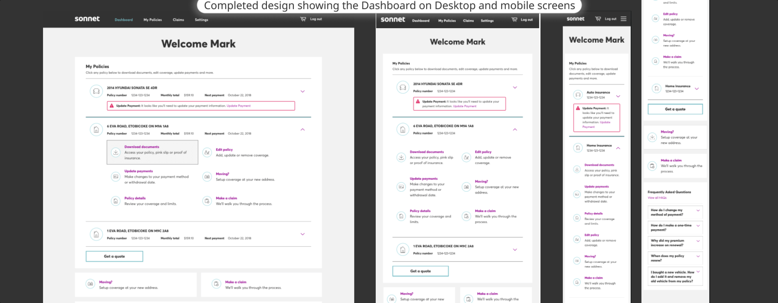
- Problem
- Policy rows were detached from a generic Quick and Easy block — customers could not directly act on a specific policy without navigating away from their primary context.
- Why it mattered
- Insurance customers visit infrequently but need important information quickly. Friction in locating documents, payments, or coverage details undermined Sonnet's digital-first positioning.
- My responsibility
- Led the project and UX, overseeing interaction and visual design. Divided discovery work with the team, co-designed with two peers, and collaborated with analytics, technology, copywriting, and UI design.
- What changed
- Expandable per-policy drawers replaced the detached Quick and Easy block — six contextual actions per policy, clearer self-service destinations for documents and payments, and a coherent responsive layout for desktop and mobile.
The problem
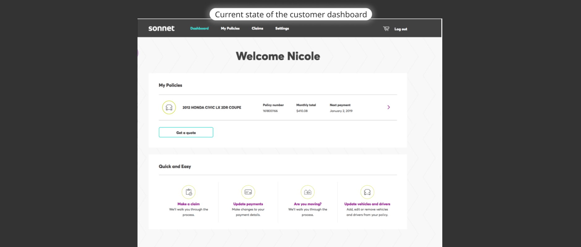
Sonnet's original dashboard, unchanged through 2019, displayed policy rows in one area and a detached Quick and Easy block in another. The block offered generic links — Make a claim, Update payments, Are you moving?, Update vehicles and drivers — with no connection to a specific policy. Insurance customers visit infrequently but arrive with a clear intent. The disconnected structure meant customers could not act on a specific policy without leaving their primary context to navigate separately.
- 01
Customer logs in
Customer arrives at the dashboard with a specific intent — download a document, update a payment, or check a policy detail. - 02
Sees policy rows
Policy rows display the policy name, number, monthly total, and next payment — but offer no direct actions or contextual links. - 03
Looks to Quick and Easy block
Generic action links (Make a claim, Update payments, Moving?, Update vehicles and drivers) appear in a separate block — not tied to any specific policy. - 04
Navigates away to complete task
Customer must leave the dashboard context to access documents, payments, or coverage details — breaking the relationship between their policy and their intended action.
The separation of policy rows from contextual actions was the core structural breakdown — customers with a specific policy intent had no direct path from the dashboard.
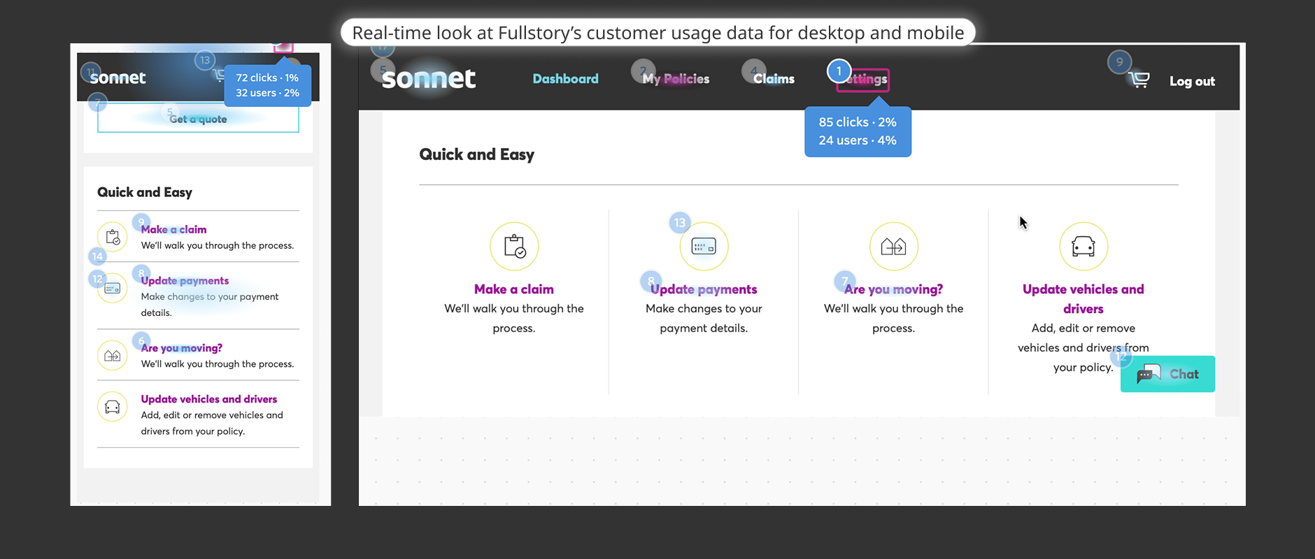
Analytics instrumentation was not in place at the start of the project. FullStory session replays served as the primary quantitative and qualitative data source. The solution needed to work within Sonnet's existing tools and technology stack. Design standards had not been fully established at the time the original dashboard launched.
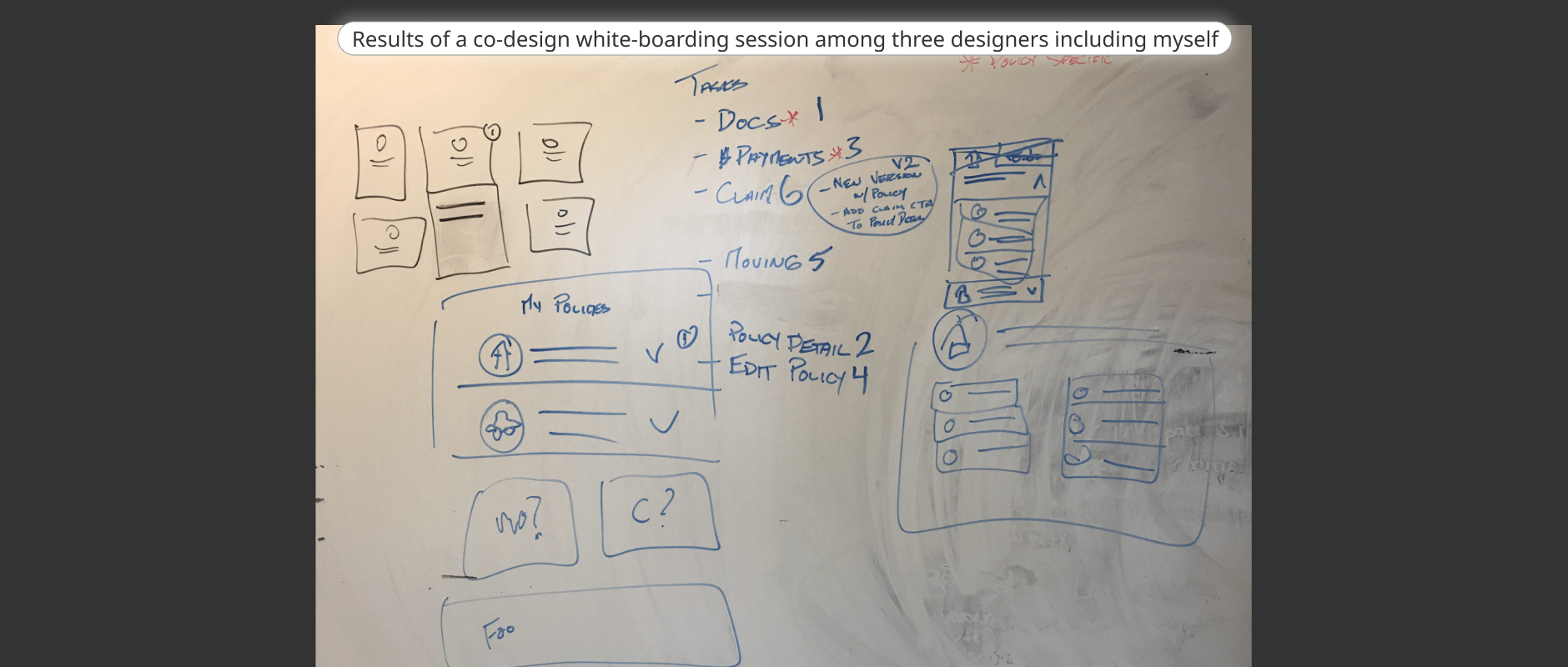
Spent one week gathering customer insights on key tasks and their importance. The team divided discovery work. Reviewed FullStory session recordings for quantitative and qualitative behavioural observation. Conducted a content audit against existing and emerging design standards. Ran a co-design whiteboarding session with two other designers — three designers total including Roger — to brainstorm and sketch the information architecture, task prioritisation, and policy drawer structure.
The decisions
Three consequential design choices defined how the redesigned dashboard worked: contextualizing actions within each policy through expandable drawers, clarifying self-service destinations for documents and payments, and making supporting actions and responsive presentation coherent across desktop and mobile.
Contextualize actions within each policy using expandable drawers
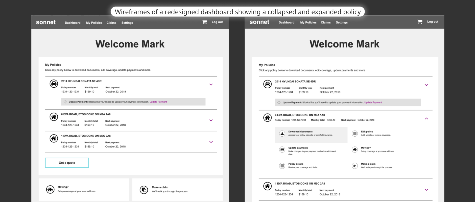
The co-design whiteboard session (three designers including Roger) prioritized the top customer tasks: Documents first, Policy Details, Payments, Edit Policy, Moving, and Claims. This informed the drawer structure: each policy row can be expanded to reveal six contextual actions — Download documents; Update payments; Policy details; Edit policy; Moving?; Make a claim.
In the collapsed state, each policy row shows the vehicle or property name, policy number, monthly total, and next payment date. A payment warning — where present — links directly to Update Payment within the affected policy rather than appearing as a generic site-wide alert. Expanding one policy keeps others collapsed.
The co-design session output and wireframes show this structure. The whiteboard labels and sketches reflect observed priorities from the session; the drawer interaction is visible in the wireframe artifact. This is a design-based architectural decision — no comparative experiment or measured click-reduction data is available from the source.
Clarify self-service destinations for documents and payments
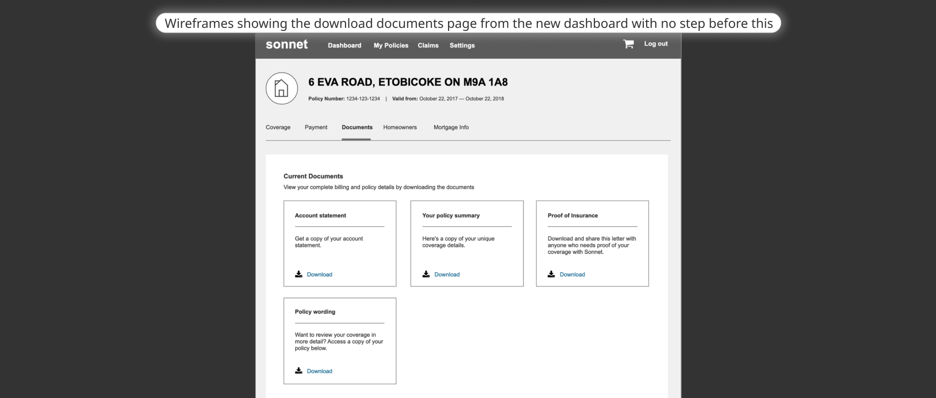
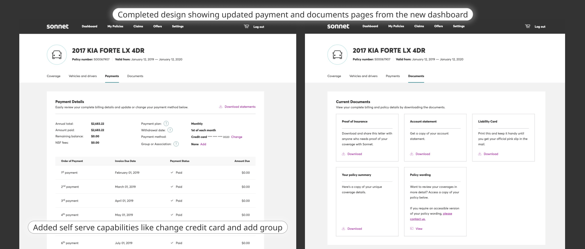
The Documents wireframe groups Account statement, policy summary, Proof of Insurance, and Policy wording into four cards with Download actions. The completed design adds a Liability Card. In that completed version, Policy wording has a View action and a contact link for an accessible version.
The completed payments page shows summary amounts, statements, plan details, withdrawal date, a masked payment method with Change, a group/association field with Add, and a schedule table.
These are visible design affordances, not evidence of completed transactions or measured task success. The wireframe caption describes direct access from the dashboard, but the source does not provide a measured reduction in steps.
Make supporting actions and responsive presentation coherent
The source prose describes Moving? and Make a claim as lower-frequency, non-direct actions positioned below the policy area, alongside FAQs targeting self-service and retention. The completed design artifacts also show Moving? and Make a claim visible inside the expanded policy drawers. Both placements are observed in the source — the lower grouping is described in the narrative while the drawer placement is visible in the screens. This account preserves both without resolving or erasing the difference.
The completed responsive image (4873) shows desktop and real product mobile views side by side. On mobile, policy drawers stack vertically with a payment warning visible; lower Moving? and Make a claim cards appear below the policy area; five collapsed FAQ items and a View all FAQs link are present. No expanded FAQ answers, empty/error states, or first-login flows are visible or confirmed in the source.
FAQs are described as supporting common questions and aimed at self-service and retention — their presence is a structural decision visible in the completed design.
Working with the team
I led UX, interaction design, and visual design oversight — dividing discovery work with the team, running a co-design session with two other designers, coordinating technology feasibility, and collaborating with copywriting, a UI designer, and analytics across discovery, design, and delivery.
Product
Scoped and directed the project; coordinated delivery timeline and team priorities across disciplines
Analytics team: instrumented analytics before launch; planned session-recording monitoring to scale future improvements
Design
Roger: led UX, interaction, and visual design oversight; divided discovery with the team; co-designed with two peers; iterated wireframes; coordinated handoff
UI designer: applied visual aesthetic to wireframes as technology ramped up. Copywriter: collaborated on interface messaging. Two peer designers: co-design whiteboard session
Technology
Technology colleagues discussed technical feasibility. The UI designer applied the visual aesthetic to the wireframes as the technology team ramped up. Detailed handoff documentation and build constraints are not published.
Analytics instrumented before launch; FullStory session replay monitoring planned to inform future iterations
Spent one week gathering customer insights on key tasks and their importance. Divided discovery work across the team. Reviewed FullStory session recordings — the primary data source, as analytics were not instrumented at project start. Conducted a content audit against existing and emerging design standards. No recruitment, interviews, usability study, A/B experiment, or participant sample is reported by the source.
Ran a whiteboarding co-design session with two other designers (three total including Roger) to brainstorm task priorities and sketch the policy drawer information architecture. Iterated wireframes for collapsed/expanded drawer states, documents destination, and payments layout. A UI designer applied the visual aesthetic to wireframes as technology ramped up.
Coordinated with analytics, technology, copywriting, and UI design through delivery. Analytics were instrumented before launch. Planned ongoing monitoring via analytics and session recordings to scale future improvements. No later findings or completed post-launch iterations are reported by the source.
Enabling delivery
Delivering the redesign required working within Sonnet's existing tools and technology, coordinating across analytics, technology, copywriting, and UI design, and adding analytics instrumentation before launch to enable future monitoring.
Led the project and UX, overseeing interaction and visual design. Divided discovery work with the team, reviewed FullStory recordings, audited content, and co-designed with two other designers. Worked with technology on feasibility and with copywriters on messaging; the UI designer applied the visual aesthetic to the wireframes.
UI designer: applied visual aesthetic to wireframes as technology ramped up. Copywriter: collaborated on interface messaging. Technology team: feasibility consultation and build within existing tooling. Analytics team: instrumented analytics before launch and planned session-recording monitoring for future improvements.
Two peer designers — co-design session participants. UI designer — visual aesthetic application. Copywriter — interface language. Technology team — build and feasibility. Analytics team — instrumentation and monitoring planning.
The result
Six tasks per policy is a design count visible in the expanded drawer. The published account also reports 100% retention improvement and 100% refined user experience, without a defined calculation, baseline, cohort, or reporting period. Analytics were added before launch for planned future monitoring.
6
Delivered design count: six contextual actions visible in each expanded policy drawer — Download documents, Update payments, Policy details, Edit policy, Moving?, Make a claim. This is a design count, not a success or conversion metric.100%
AUTHOR-REPORTED CLAIM. This is not a verified retention rate or measured lift. The before-state is characterised as 0% attention to retention in the dashboard — a characterization, not a measured zero. Baseline, calculation, cohort, sample, and reporting period are not provided by the source.100%
AUTHOR-REPORTED CLAIM. This does not correspond to a defined UX metric. The before-state is characterised as a refined experience limited to quotes and FAQs. Calculation, scope, and reporting period are not provided by the source.Generic Quick and Easy block — policy-agnostic actions, no contextual path from a policy row to documents, payments, or coverage details
Original dashboard — policy rows above a detached Quick and Easy block. Dashboard launched 2016; source describes unchanged through 2019.Six contextual actions per policy — Download documents, Update payments, Policy details, Edit policy, Moving?, Make a claim — plus coherent responsive desktop and mobile presentation
Completed dashboard redesign — desktop and mobile. This is a design evolution comparison, not a controlled before/after experiment.Analytics were instrumented before launch to enable monitoring from the outset. FullStory session recording review was planned to scale future improvements. The source reports no retrospective findings, completed post-launch iterations, or measured channel-traffic results at the time of writing.
All three result figures are author-reported claims from the published case study by Roger Ennis. The 6-task figure is a delivered design count, not a success metric. The 100% retention improvement is not a verified retention rate or lift. The 100% refined experience has no defined UX metric. Calculation, baseline, sample size, and reporting period are absent for all figures. No first-contact resolution, task-completion, or time-on-task improvement is claimed.