
Return to home
 CASE STUDY / 02
Redesigning Condition Management
BMO’s mortgage-condition workflow relied on separate CFS and CCAPS systems. UI errors, missing feedback, and unclear document completion slowed work for bank stakeholders and customers. As Lead UX for condition management, I built on earlier exploration and helped connect the retained systems through a refreshed Condition Hub. The published account reports 25 minutes to complete purchasing, 16 minutes to application approval, and one day to complete an application. Measurement method, sample size, and reporting period are not provided.
 Condition Hub — dashboard states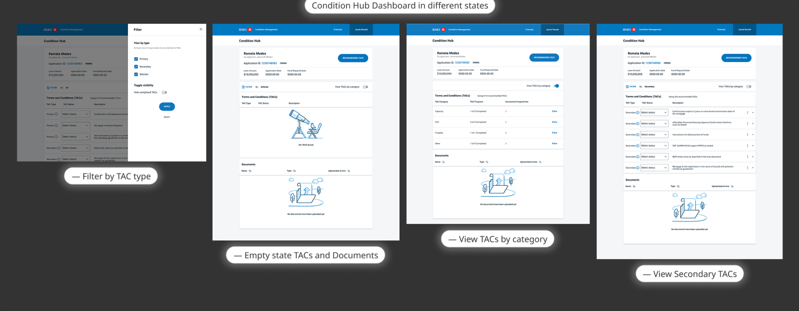
- Problem
- Two misaligned legacy systems (CFS & CCAPS) made condition fulfilment slow, opaque, and error-prone for mortgage applicants and bank staff.
- Why it mattered
- Completing a mortgage application took up to three days. UI errors froze systems; applicants received no feedback and experienced repeated delays.
- My responsibility
- Lead UX for condition management: discovery, interaction design, component creation, prototyping for research, copy collaboration, and handoff over eight months.
- What changed
- A unified Condition Hub connected CFS and CCAPS behind a coherent interface, making requirements reviewable, progress visible, and additional work actionable.
The problem
Two separate legacy systems — CFS for conditions and CCAPS for mortgage applications — handled different parts of the same process, managed by teams that were not aligned. UI errors could freeze either system, and customers often received no feedback about what was missing or still required.

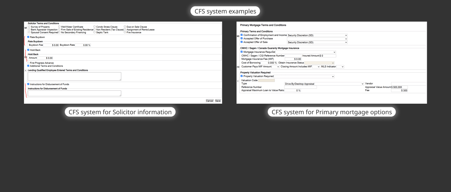
- 01
Receive conditions
Applicant receives a list of terms and conditions across disconnected systems; no consolidated view. - 02
Upload documents
Customers often believed all required documents were uploaded when they had not been — causing further delays with no system feedback. - 03
Await review
UI errors in CFS or CCAPS could freeze the system; staff and customers had no visibility into approval status. - 04
Approval or delay
Finalizing an application took around 45 minutes; approvals often exceeded 24 hours; total completion could take three days or more.
Opaque status and disconnected systems were the core breakdown — applicants could not tell what was still needed or why approval was delayed.
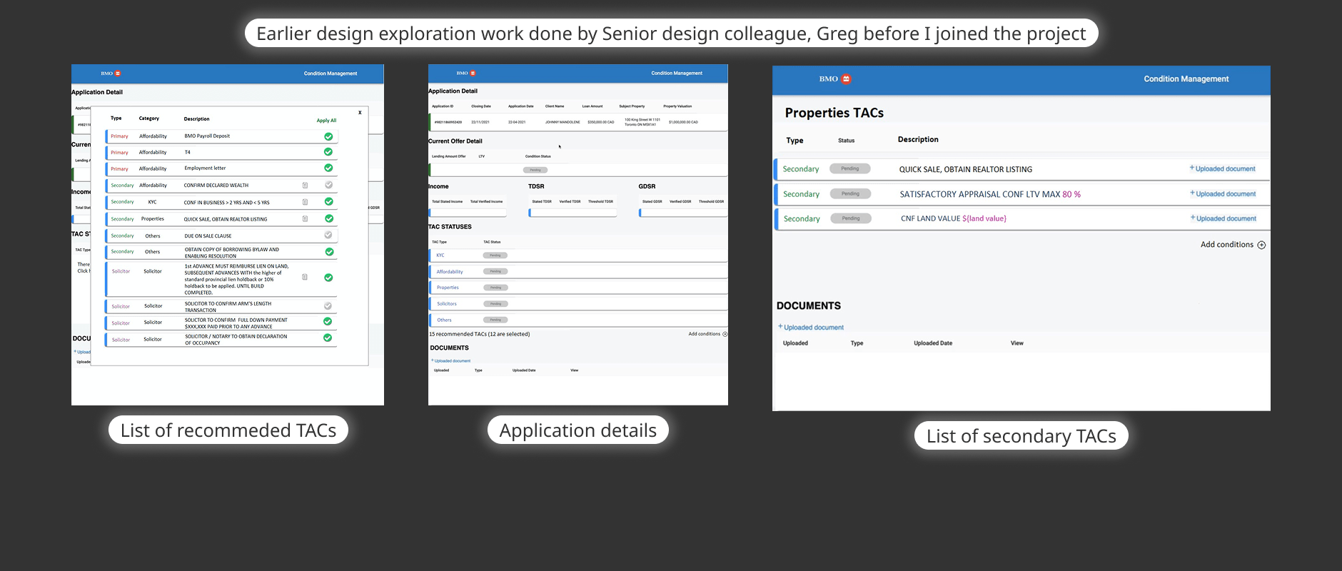
The principal systems were staying in place. The design needed to connect them through a refreshed experience while working with the technology team’s limitations. I joined one month into development, taking over Lead UX from senior colleague Greg, within an approximately eight-month delivery window.
I reviewed Greg's earlier semi-lean UX exploration, spoke to key stakeholders including the Product Owner, and worked with the UX Researcher to understand customer struggles and expectations. The team operated in an Agile cadence with Figma as the primary collaboration tool.
The decisions
Three consequential design choices defined how the new Condition Hub worked: how the systems would be connected, how requirements would be communicated, and how additional work would be supported with clear feedback.
Connect the systems through a coherent experience
Keep CFS and CCAPS, and connect them through a refreshed Condition Hub. Four dashboard areas organize application status and information, filtering by TAC type, terms and conditions, and uploaded supporting documents.
This focuses the redesign on the user-facing workflow rather than replacing core platforms. The published screens show filters, categories, progress, unresolved irregularities, empty states, and status visibility.
Make requirements understandable and reviewable
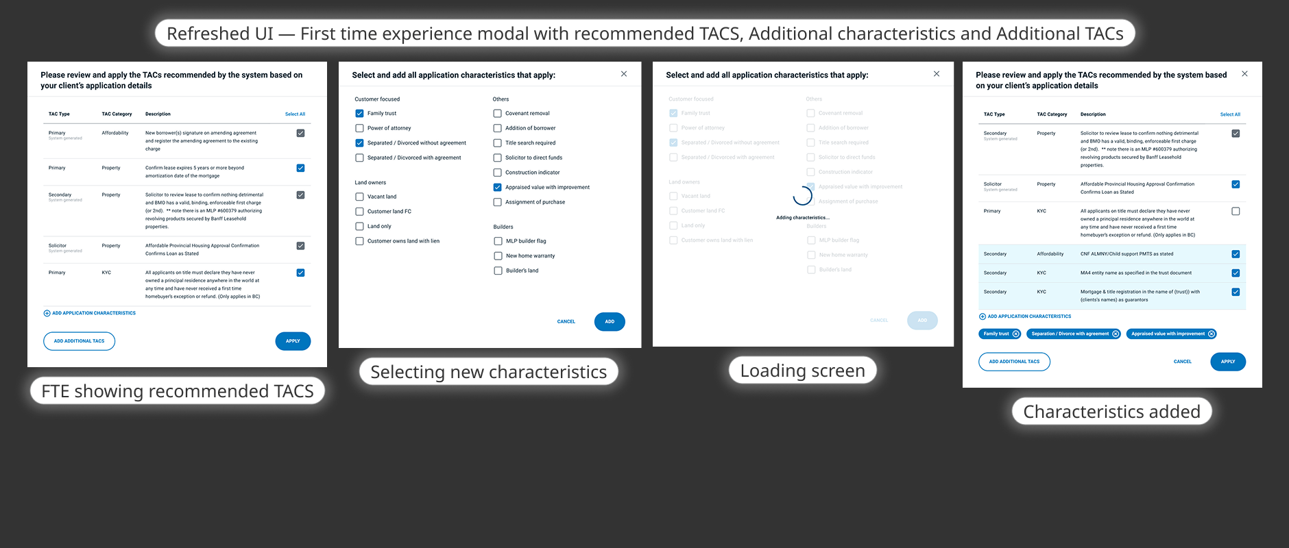
TAC types were made explicit and distinguished: Primary (most important to satisfy first), Secondary (can be dealt with later), and Solicitor (used by the application's lawyer). Each condition included a description so applicants understood what was being asked.
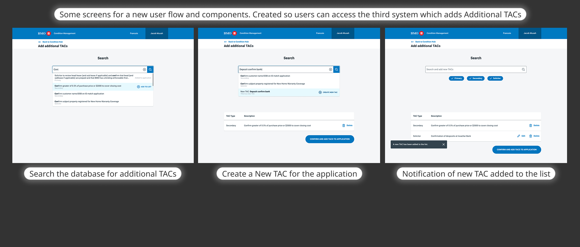
Recommended TACs were derived from personal information already supplied by the applicant — customers could review and select the relevant items rather than guess. An additional system surfacing mortgage options and application characteristics emerged later in the project, adding a review → characteristic selection → loading → confirmed-added flow.
Status codes were retained from the underlying system to support bank-side clarity.
Support additional work with clear, actionable feedback
Missing feedback made it difficult to know what had happened or what remained to do. The additional-TAC flow supports searching existing conditions, creating a new TAC, confirming its addition to a list, and adding selected TACs to the application.
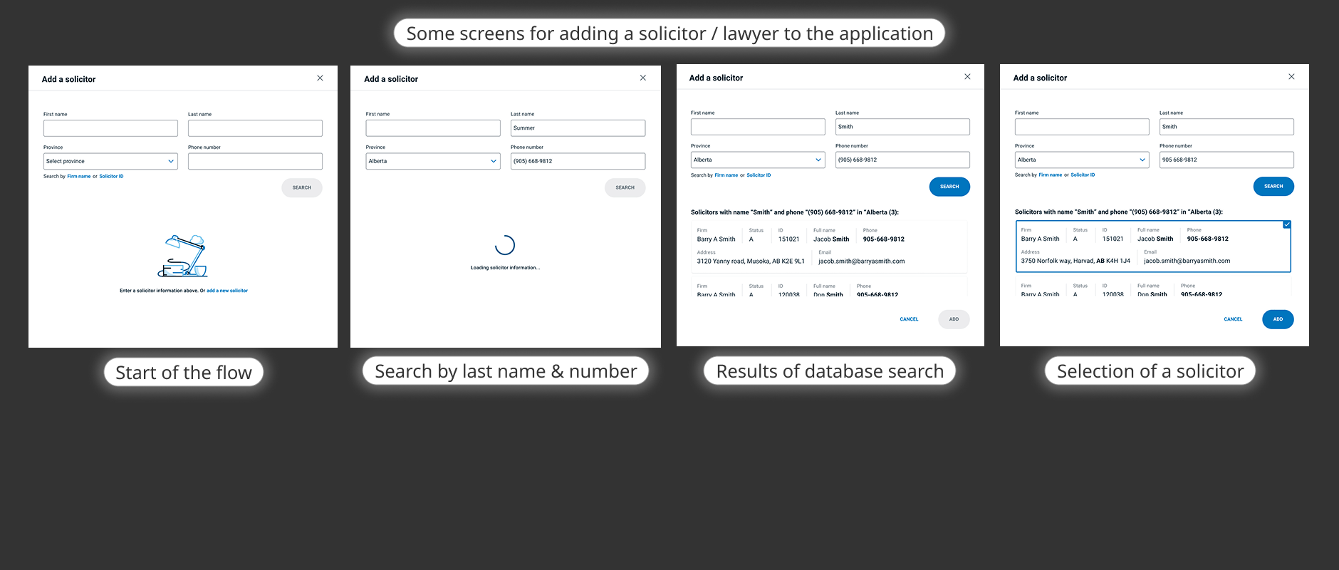
The solicitor flow shows the starting state, search by name and phone number, loading, database results, and selection. These are visible interface responses to the feedback problem, not individually measured improvements. The source does not provide a definitive integration architecture.
Leading the work
Identifying customer and business needs, making design decisions under development constraints, and coordinating across disciplines to deliver a coherent experience within an eight-month window.
Product
Identified customer and business needs; defined scope boundaries for CFS/CCAPS retention
Product Owner and Business Analyst coordinated Agile delivery and launch
Design
Built and added features; incorporated existing design-system components and created new ones; sought feedback from other designers
Assembled prototype quickly for UX research to test and gather feedback immediately before launch
Engineering
Technology team; discussed limitations with tech to find feasible solutions within CFS/CCAPS constraints
QA and the Scrum Master were part of the cross-functional delivery team. The published account does not describe their detailed responsibilities.
Reviewed Greg's earlier exploration, consulted the Product Owner and Business Analyst, and worked with the UX Researcher to understand what customers and the business needed from condition management.
Partnered with a copywriter on interface text and discussed delivery limitations directly with the technology team. The remote working setup relied on Figma and Agile ceremonies to keep alignment across disciplines.
Assembled a prototype quickly enough for the UX Researcher to test and gather further feedback immediately before launch — ensuring late-stage issues could still be identified and addressed.
Building on the team's work
I joined one month into development, continuing from the foundation established by senior colleague Greg. The work across eight months was genuinely collaborative — involving a Product Owner, Business Analyst, Scrum Master, copywriter, UX Researcher, QA, and the technology team.
Continued from Greg's exploration; built and added features to the Condition Hub; incorporated existing design-system components and created new ones; sought feedback from other designers; partnered with the copywriter on interface text; discussed constraints with the technology team; assembled the prototype for pre-launch research.
The UX Researcher supported discovery and prelaunch testing; the copywriter collaborated on interface language. The Product Owner and Business Analyst coordinated launch. The Scrum Master, QA, and technology team were also part of the cross-functional team.
Greg — senior design colleague, earlier UX exploration and initial direction. UX Researcher — user research and testing. Copywriter — interface text and language. Product Owner, Business Analyst, Scrum Master, QA, and technology team — delivery, coordination, and launch.
The result
Three figures reported in the published case study. Usability issues were addressed and the process was made easier. Measurement method, sample size, and reporting period are not provided.
25
Figures reported in the published case study; measurement method, sample size, and reporting period are not provided. The source gives no directly comparable purchasing-time baseline.16
Previously approvals often took more than 24 hours per the published account. Figures reported in the published case study; measurement method, sample size, and reporting period are not provided.1
Previously total completion could take up to three days or longer per the published account. Figures reported in the published case study; measurement method, sample size, and reporting period are not provided.Two disconnected systems, opaque status, missing feedback, and UI errors that could freeze the process
CFS and CCAPS — the two main systems used to process a mortgage application before the redesign.A unified Condition Hub connecting both systems — conditions categorised, requirements explained, progress visible, additional work actionable
Condition Hub dashboard states — this is a design evolution comparison, not a controlled before/after test.Mortgage processing proved more complex than initially understood. Additional-system requirements — surfacing mortgage options and application characteristics — emerged during the work and had to be incorporated. When the eight-month deadline arrived, the Product Owner and Business Analyst coordinated launch, and I moved on. No published postlaunch adoption data or formal test methodology exists in the source.
All three result figures are reported in the published case study by Roger Ennis. Measurement method, sample size, and reporting period are not provided. The 45→25 minute comparison uses different labels ("finalizing" vs. "completing purchasing") and should not be treated as a verified like-for-like reduction. No zero-error or measured error-rate reduction is claimed.